Short in text: I had design of my shape made in Gimp bitmap image. Then I recreated those shapes directly in PDC Editor moving peach point to proper position according to pixels in my Gimp bitmap. Tool itself is not good for prototyping because it lacks many convenient editing and transform features that are expected from such software and because the PDC format itself is very primitive and I’m trying to keep this tool very close to the binary itself.
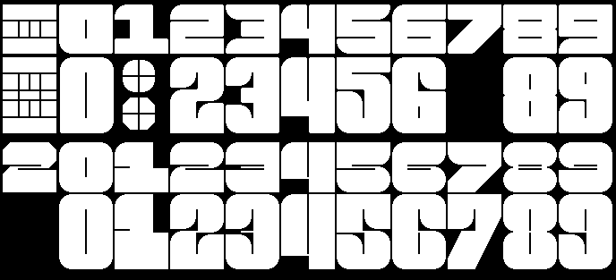
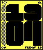
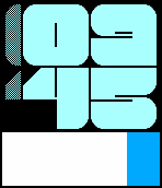
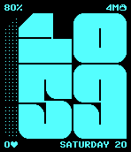
I was very unhappy about the look of small number 1 and 3, and tall numbers for 1 and 7. Also I didn’t liked that numbers 2, 5 and 6 looked too similar to Brutal watchface font. So I decided to take the idea of narrow lines to extreme and added more rounded corners. I’m quite pleased with the result.
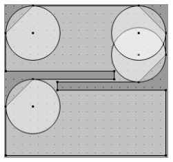
I also figured out how to implement rounded edges. I can’t just draw arcs in PDC because it’s impossible to get pixel perfect result on both Aplite and Basalt. I can’t use circles because those will overlap with empty spaces in many numbers. I initially wanted to simply have a circle as bitmap and then render selected quarters over diagonal edges. But with that I would not have antialiasing on Basalt. But looks like it’s possible to have separate PDC with just one circle shape and with proper position and viewbox size you can render selected quarter. It gives pixel perfect result on Aplite and on Basalt antialiasing will be used according to defined background and foreground colors.
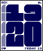
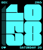
I personally prefer the second font here for how unique every number is versus the first. I think the shorter numbers more closely matching the big ones is a nice design and it feels like they’re just squished organically.
The rounded corners feel more childish in a good way which I think was the goal of the face and makes me think of my favorite guy, Blob, more.
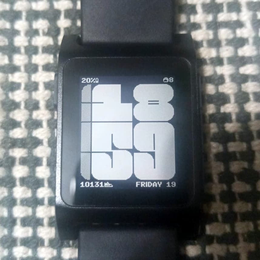
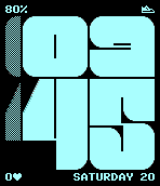
Beta 2 is official. Watchface is finally usable. The main font took a lot of time because in order to get satisfying results I made this PDC Editor tool. And after spending few hours drawing those fonts over and over again I’m rly glad I made it. And yes, it’s the middle of the night, which is why Blob is sleeping.
What has been done:
Main font for hours and minutes.
Some basic Blob logic, but not all of it, most of the expressions are chosen randomly.
Congratulations on the release! I’ve already got it downloaded and configured! Quiet time notifications is a big deal to me because I use it all the time and consistently forget to turn it off.
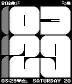
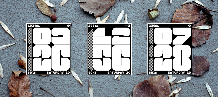
I’ve got Blob and the month name in the top left. Quiet time in the top right. And day date in the bottom right. As always, using strftime patterns is a genius idea for customization.
I can’t wait to see this on a color screen based on those screenshots too!
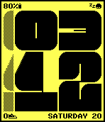
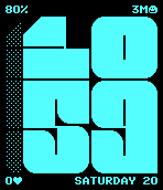
Thank you. It was quite a project. Especially this side quest with PDC editor. I myself was not that interested in color versions until I did few tests on emulator. Some of color combinations look sick!
Like always I’m happy to see photos of watchface from anyone that like it. I will write a blog post in upcoming days, similar to what I did for Brutal. I will include photos from users if I get any.