TimeStyle by Freakified
![]() There’s another cool watchface on the Rebble App Store!
There’s another cool watchface on the Rebble App Store!
Go check it out in the App Store!
![]() There’s another cool watchface on the Rebble App Store!
There’s another cool watchface on the Rebble App Store!
Go check it out in the App Store!
![]() Freakified just released version 7.8 of TimeStyle!
Freakified just released version 7.8 of TimeStyle!
V 7.8 “Higher DPI”
- [Improvement] Redesigned font size modes for the Pebble Time 2 and Round 2; the era of defaulting to tiny fonts is over!
- [Improvement] Now supports the Pebble Round 2!
![]() Freakified just released version 7.9 of TimeStyle!
Freakified just released version 7.9 of TimeStyle!
V 7.9 “Oh no I forgot to test the config page”
- [Fix] Pebble 2 Duo no longer shows color config page
- [Fix] Pebble Round 2 now properly shows round watch config page
![]() Freakified just released version 7.10 of TimeStyle!
Freakified just released version 7.10 of TimeStyle!
V 7.10 “Apparently large fonts require more space”
- [Fix] Monday is no longer shown as “M…” when large fonts are enabled on Time 2
- [Change] Sidebar is now slightly wider on Time 2 when large fonts are enabled
- [Change] Sidebar now uses bold large font for the Time 2
@freakified Hey I love TimeStyle and used to rock almost all the time (lol) on my PTS. But I moved to a PTR and waiting for a PR2 and I find im using it less. My fav thing was how the side bar could mirror the timeline ribbon on square/rectangle devices but it doesn’t look the same on the round one. Would it be ok to make a feature request and consider mirroring the same view as on on square screen for the round, with the limitation in only 2 icons not to make it bloated?
Glad you’re enjoying it (on the PTS at least!) I’m always open to suggestions related to the round appearance; I was never entirely satisfied with it.
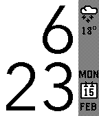
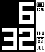
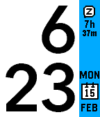
For your idea specifically, I actually considered this when initially designing the Round version! But, the problem is, the real round timeline only shows one icon, centered:
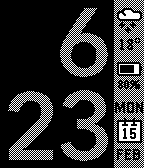
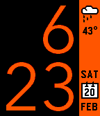
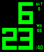
So, for TimeStyle, if we position the sidebar widget in the exact same way as the real timeline, we get this:
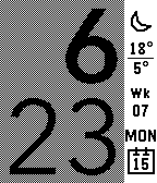
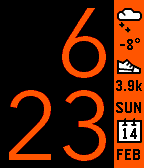
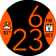
I actually kind of like that look, but the problem is there isn’t really enough room for even 2 widgets at that size! I might be open to adding this as an option though. ![]()
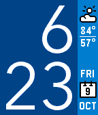
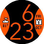
In theory, if we remove the left padding and the little arrow graphic, it becomes possible to squeeze two widgets in, but I’m less enthusiastic about the look:
It feels kind of cramped to me, and also it’s sufficiently different enough from the real timeline appearance that I’m not sure if it solves the original problem.