BRUTAL by irek
 There’s another cool watchface on the Rebble App Store!
Read more about Brutal on BRUTAL

Go check it out in the App Store!
There’s another cool watchface on the Rebble App Store!
Read more about Brutal on BRUTAL
Go check it out in the App Store!
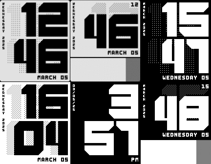
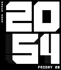
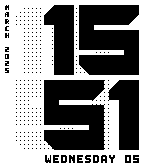
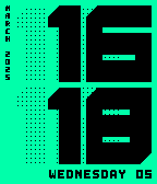
 Diorite screenshots:
 Chalk screenshots:
 Emery screenshots:
 Aplite screenshots:
 Basalt screenshots:
 Update alert!
 irek just released version 4.6 of BRUTAL!
Add more keywords to watchface metadata like “seconds”. Recently reading reddit/r/pebble I learned that people are trying to find watchfaces with support for seconds and there are not that many. Someone suggested to search using “seconds” keyword.
I think this was the final final release. And today it reached 200 likes 
Overall I’m super happy with this project but in retrospective the decision to render big font from bitmap image was a mistake that resulted in many extra lines of code and memory issue. It should have used PDC.
I love this! The first face I used on Emery when I got my test unit 
 Update alert!
 irek just released version 5.0 of BRUTAL!
Recreate watchface from scratch. Port text features from Jealous watchface including weather.
Read more about v5 release which brings weather to Brutal but at the huge cost of rewriting everything from scratch BRUTAL
Using this immediately as well and the weather is such a welcome addition that I fear Brutal won’t be off my watch for a very long time. This is great work like always!




 Update alert!
 Update alert!