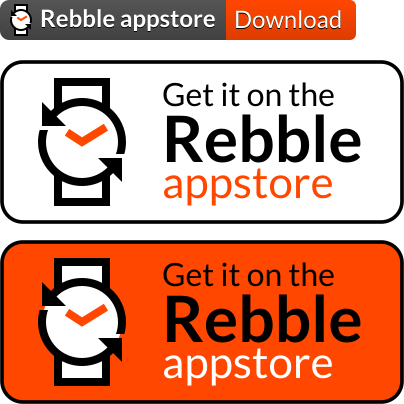
oh yeah these first two looks great! I want to nitpick the text contrast on the third, I prefer white-over-orange to black-over-orange, but I see what youre doing with the contrast.
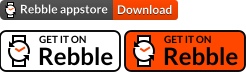
We can put that first one into Bobby’s readme, and our personal watchapps to start off!
After we figure out something for everyone, we should add this to the developer documentation and perhaps the developer portal to allow easily copying the correct link for your app. What do you think @Will?
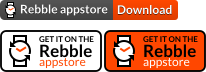
I really like the small github-readme style banner. Stylistically it’s perfect.
When I tried to open it in Illustrator, the type reflowed strangely because I didn’t have that typeface on my system. Is that something we’d have to worry about in a browser?
The logo – should we use a more generic watchapp, download, or app store icon like from Cobble here? The rebble logo does work, but I worry a bit about ambiguity (despite the “rebble appstore” text which definitely disambiguates it)
The larger ones are okay – the black outline stroke, and the white background, don’t do it for me. I want to play with gradients on those, and maybe subtle inner shadow to get at the same effect
Oh, okay, I actually just looked at these for the first time in context! The border is fine. Maybe change “get it on rebble” to “get it from rebble”? The language feels a little weird to me (possibly just proximity to rebble things giving me a different perspective)
We can ship the fonts turned into paths, which should eliminate this issue, since we aren’t expecting people to modify the text. That does remove some amount of accessibility though, but I think it should be treated as an image, so with an alt text provided it should be fine.
I do prefer textual disambiguation to icon disambiguation, but I’m fine with either, if you find any other icon I could use